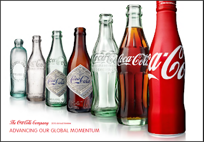
We are all familiar with the brand "Coca-Cola" and we are also all familiar with the five sense we are all born with; (1) sight, (2) hearing, (3) touch, (4) smell, and (5) taste. What a lot of us don't know is how to use all five of these sense in our marketing techniques. When our body receives information the brain is not the only organ that interprets the information, all of the body translate the message differently depending on its main sensory. When you are trying to appeal to a potential customer you may only be using the bare minimum in "sensory" tactics. By collaborating all five of these senses into your marketing campaign you can redesign your product from a non-seller to a powerhouse.
Martin Lindstrom (the author of Buyolgy) is a dedicated researcher of sensory marketing. Lindstrom believes that in order for your brand to be successful you must incorporate every sense and treat them as equals. The purpose of this equal incorporation is to design your brand to be recognizable if you deleted one or more senses.
The five sensory's should be targeting as such:
(1) Sight : logo, product design, color(s), typeface (using the eyes)
(2) Sound : music, product sounds (using the ears)
(3) Taste : product taste, edible favors/gifts (using mouth and tongue)
(4) Smell : environmental aroma, product aroma (using the nose)
(5) Touch : product surface and shape, marketing materials, environment surfaces (using hands, feet, and skin)
This marketing technique of "sensory" targeting should always be kept consistent. The key to building your brand is to make your brand the same in sight, sound, taste, smell and touch at any point in time.
A perfect example of a sensory targeted brand in Coca-Cola. Let show some examples:

Although the design of the bottle has slightly changed, you can see that the Coca-Cola scripted logo has been the same since 1899. The design of the bottle has always been so similar that even if you remove the scripted logo, the audience still knows that it is Coca-Cola.
Coca-Cola has marketed their product with not only the red and white colors with the scripted font, but with the use of the "coke" bottle itself. In its logo design it has targeted the sight of their customers, the taste (the taste same remained the same in 1899), the sound (the pop of the bottle), the smell, and the touch (keeping the shape of the product consistent throughout the years even though the materials may have changed). Coca-Cola is one of the best examples of positive sensory marketing that has shown tremendous branding results.
No comments:
Post a Comment